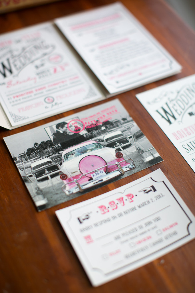
Happy Tuesday all! Today I wanted to touch on the art of typography. Typography is the technique of arranging typefaces to make an appealing and recognizable design. In stationery, we use typography to distinguish between lines and to enhance the design. Take this invitation suite, for example:
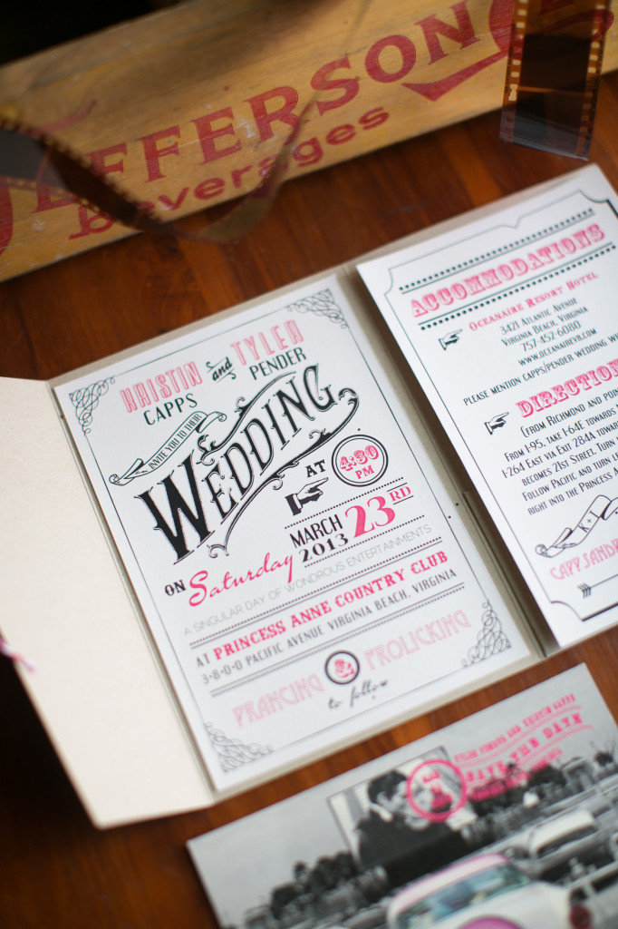
There are almost too many typestyles to count! The combination of multiple typestyles to create the overall aesthetic of the invitation suite is an example of typography. In this instance, the mixture of typestyles creates a vintage theme that you will see is tied throughout the couple's save-the-date, invitation suite, and day-of paper products.
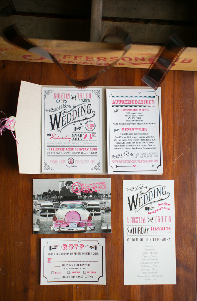
The invitation suite is placed in a pocketfold. Pocketfolds are a great way to organize your invitation suite, especially if you have multiple inserts!
What I love most is that each of the pieces of their wedding day products are similar and different. By using the same typestyles throughout the individual pieces, the wedding stationery is cohesive. The addition of different borders and motifs allow for subtle differences that play into the vintage theme.
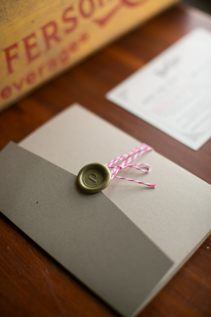
Here is a picture of what the outside of the pocketfolder looked like. We placed a wax seal with the soon-to-be last name initial and used bakers' twine to seal the pocketfold.
We will revisit this save-the date again in the near future when we discuss how to set the tone from the very beginning of your wedding stationery products.
The vintage postcard sets the tone for the remaining pieces we designed for the happy couple. The vintage postmark adds the final touch to this save-the-date postcard!
Please stay tuned for our new blog post next week! As always, please do not hesitate to contact us if you are interested in discussing your wedding stationery visions or if you would like more information.
